Personal finance management dashboard
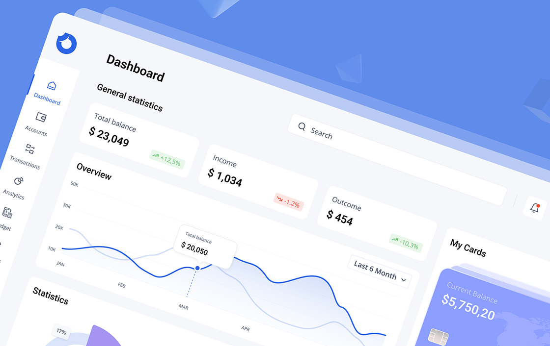
The financial dashboard is crafted to streamline the management of personal finances, offering users a clear and comprehensive view of their financial activities. The design prioritizes ease of use, making it simple to navigate and understand financial data at a glance.
With its intuitive layout, users can effortlessly track recent transactions, monitor income, and analyze spending habits.
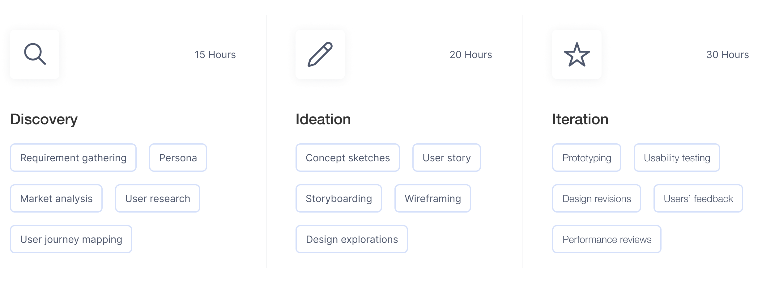
Before creating the design, we identified several challenges that needed to be addressed:
To address these challenges, we devised a comprehensive set of solutions:
FundTrack is a comprehensive finance dashboard designed to simplify personal financial management.
Designed with simplicity and efficiency in mind, FundTrack allows users to manage their finances effortlessly, helping them stay informed and make confident financial decisions.
FundTrack provides real-time insights into spending, savings, and investments, empowering users to easily monitor and track their progress toward both short-term and long-term financial goals.

With real-time updates and interactive features, users can track their expenses, set savings goals, and view detailed financial reports, enabling smarter decision-making and better financial planning.
The dashboard’s intuitive layout makes it easy to identify spending patterns and areas for improvement, helping users stay on top of their financial health. With personalized insights, users can confidently take control of their financial future.

Users can tailor the dashboard to their specific needs by customizing widgets and selecting the financial data that matters most to them, ensuring a highly personalized experience. With interactive charts and graphs, they can effortlessly visualize spending habits, income sources, and track financial growth over time.
The flexibility of the dashboard ensures that users remain in control of how they manage and engage with their finances.

Built on a 12-column grid system, the design ensures a balanced and flexible layout that adapts well to different screen sizes. The grid provides consistent spacing and alignment across the interface, making the design cohesive and easy to navigate.
This structure allows for seamless scaling, ensuring the dashboard remains visually appealing and functional in various contexts. By following this grid, elements are arranged logically, enhancing the overall user experience and maintaining a clear visual hierarchy throughout the platform.

Cards are designed for intuitive interaction, with cards that clearly display key financial metrics at a glance. Each card is crafted to provide quick access to vital information, ensuring users can easily navigate between different sections. The layout prioritizes clarity and functionality, making complex data easy to understand.
Additionally, users can customize the cards to highlight their most important financial insights, creating a streamlined experience that supports efficient decision-making and quick access to relevant data.

Iconography in this project is designed to be clear, consistent, and user-friendly. Each icon was crafted with a minimalistic style, ensuring they are easily recognizable and enhance the overall user experience.

We focused on creating a clean, professional layout for the finance dashboard to ensure a streamlined user experience. The design uses a neutral color palette with accent colors to highlight important data and actions. Typography is clear and easy to read, with consistent font choices for headings and body text.
All elements follow a consistent layout with proper spacing and alignment to keep the dashboard organized and user-friendly, making it easy to navigate complex financial information.


© 2025 VYDOK
All rights reserved.


© 2025 VYDOK
All rights reserved.

